Typography & Architecture — Form, Function, and the Failure of Modernism
Written in 2017 as part of course on the History of Typography
Historically, typography and architecture have both emphasized form and function. The history of both can be categorized by formal and temporal domains, often interconnected because of trends throughout history. Architectural forms are often described as “monumental,” not only because of the monuments that result, but because of their sheer visibility and size: “Form characteristics appear in architecture on a monumental scale, in type on a miniature scale.”1 Gerard Hadders wrote about “monumental typography,” equating type with image, where the “graphic form [is] an independent—call it ‘monumental’—phenomenon that concentrates on one user group and as such can be read in the urban context.”2
Historicism and Classic Influences
Hans Rudolf Bosshard in The Triumph of Typography writes that inscribing text on buildings is an “age-old custom,”3 where historic techniques and forms were upheld as the standard. For instance, Roman monuments used all capital letters, and Renaissance artisans and designers rediscovered those forms, they were updated: influencing new typefaces and incorporated into monuments once again.
The work of Peter Behrens, known mostly for his architecture but also a type designer, is a good example of how traditional formal influences shaped design. Early modern Jugendstil designers in Germany aimed to fuse life and art, an idea inspired by philosopher Friedrich Nietzsche.4 There was a debate in Germany as to whether designers should abandon their cultural blackletter (Fraktur) and adopt the classically- influenced serif typefaces (Roman) that were becoming more prevalent throughout Europe. Sans serif faces were also being created at this time. Behrens believed that “one of the most eloquent means of expressing the style of any epoch is through letterforms,”5 so looking at what typographic forms he chose to inscribe on his buildings is useful to gauging what forms were valued, and how they functioned in relation to other structures.
Two useful examples in this analysis are his inscriptions on a pavilion in Dusseldorf and the more well-known one for the AEG Turbine Factory in Berlin. The pavilion inscription was done in sans serif, specifically inspired but square, Dutch models. David Burke describes it as follows: “geometric, high contrast decoration on the flat surfaces is an evocation of classical structure elements, and the lettering can similarly be seen as rationalized Roman forms.”6 It mixed modern sans serif with clear classic influences, but that combination “vaguely misplaces, as this level of rationalization in letterforms did not even occur in the Renaissance,”7 ultimately feeling awkward, as if Behrens was working out how to reconcile multiple influences into something that makes sense.
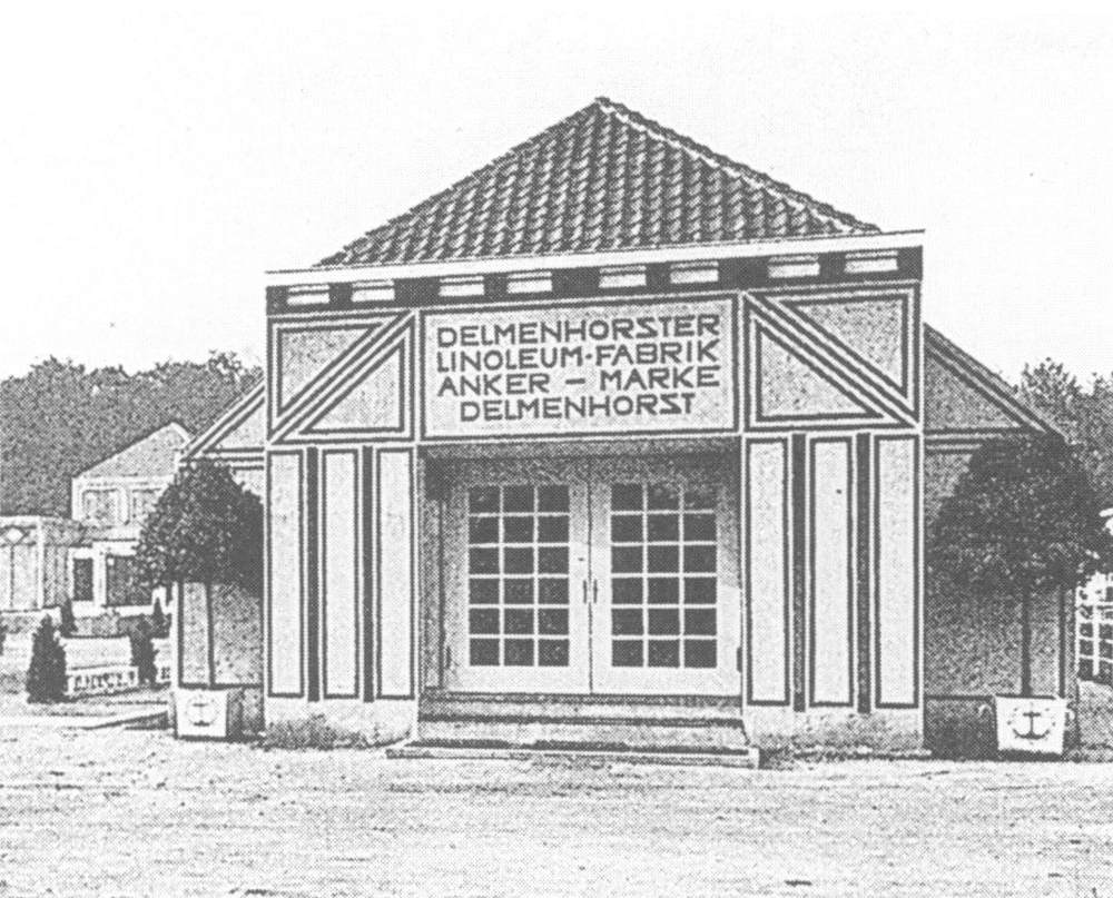
Dusseldorf Pavillion
The AEG Factory’s inscription, on the other hand, is more modernist in its ideology although it uses a classic Roman typeface. The materials are steel and glass, a simplification of physical elements, “seeking form not derived from, rather expressive of function,”8 like modernist typography with with letterforms. Burke suggests that Behrens simplified the letterforms: “rationalized and straightened, wide T and bottom- heavy B referring to classical models. Triangular serifs are refined, as are the proportions,”9 as a actual Roman inscription would have been wider and sturdier.
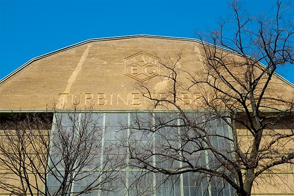
AEG Factory, Berlin
Modernism: Unity of (Simplified) Forms
Modernist architecture and typography were strict and rule-bound, prioritizing unity of form with the goal of being universal. Bauhaus founder Walter Gropius said that "the common citizenship of all forms of creative work and their logical interdependence on one another in the modern world.”10 Part of that logic was grid usage, and in the context of typography and architecture, the “three-dimensional architectural grid meets the two-dimensional typographic grid.”11
Jan Tschichold advocated sans serif, or grotesque, typefaces and using them
exclusively. Another thing he urged modern designers to do is use all lowercase;
interestingly enough, that practice never took off in architectural lettering or
inscriptions like it did on paper: “sans serif letters have dominated outdoor lettering
right up to the present day, but lowercase typography is barely in evidence. The Roman
principle of the monumental inscription with majuscules (capitals) has dominated
unabated, even after two thousand years.”12
One example of unified typography and architecture is the Bauhaus in Dessau,
Germany. The architecture was done by Walter Gropius and the lettering by
Herbert Bayer, a former student and educator at the Bauhaus. The typography adapted
a sans serif typeface that Bayer previously designed called “Universal,” based on
Russian Constructivist belief that Latin letterforms are strictly combinations of straight
lines and curves.13 Bosshard claimed that “the typeface suits the au sound: a full, round, glorious letter,”14 although only applicable when the text is set vertically like it is on the face of the building. The way he described the letterforms was so eloquent and incredibly German, but he’s not wrong. The combination of the two letterforms in that typeface on that particular buildings works, going back to the idea of unity that modernists were so fond of.
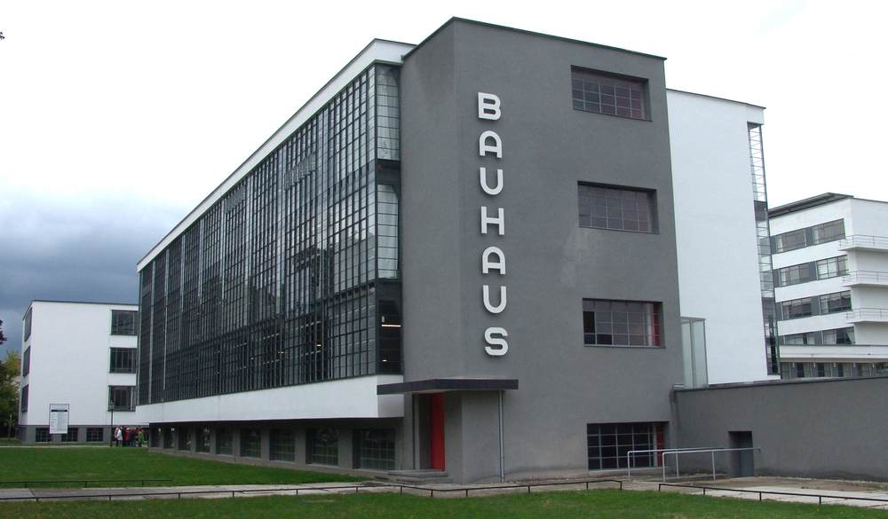
Bauhaus, Dessau
Cafe Unie in Rotterdam, Netherlands is another prime example of
modernist thinking applied to architecture and typography. In Forms in Modernism,
Virginia Smith describes how this structure showcases how typography was “integral”
to architecture in the De Stijl movement: “horizontal and vertical slabs with letters
repeat the geometric divisions of the façade; the letters fill their panels—a further
means of integrating them into the overall design.”15 J.J.P. Oud’s design uses the colours of the movement (white, grey, black, yellow, red, blue), accentuating pointed angles of the letters unlike Bayer who eliminated them. Bosshard argued that even if the letters are difficult to read, “readability is not a criterion in this architectural letter image. Typography and architecture together form a beautiful, arresting emblem.”16 In her famous Crystal Goblet speech, Beatrice Warde said that “good” typography focuses on “not ‘How should it look?’ but ‘What must it do?’ and to that extent, all good typography is modernist.”17 To that point, the aforementioned inscriptions accomplish their goals of unity of form and simplification.
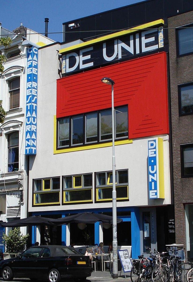
Cafe Unie, Rotterdam
Postmodernism
Modernism had lofty aims, trying to bring order to the world with universal design. But was there a universal design style, or typeface? They definitely tried, with the widespread International Style and typefaces like Helvetica and Univers, but ultimately modernism failed. Everyone on earth is not the same, and the only way to have a universal anything would be to impose it. Modernism essentially tried to colonize the world with design, carrying some problematic associations, especially since the major figures in both typography and architecture were white european men. Postmodern design celebrated diversity and individuality, as it was “not possible any longer to believe that a ‘’universal’ typeface could answer all the needs of cast and restless populations.”18 Virginia Smith summarizes the transition in design style and thinking during the twentieth century: “The century started with the search for universal pure form and perfection needed with an awareness of the interesting possibilities to be found in violating that perfection.”19
Smith points out that as the relationship between architecture and typography became more subtle, they both thought in terms of deconstruction,20 a concept that could define the period as unity defined the modern. Architects like Zaha Hadid and Frank Gehry deconstructed forms to destabilize and investigate possibilities of material.21 Their work is expressive and dynamic, pushing the limits of structure and form. Jarring and dramatic, postmodern architecture, and design in general, sought to capture attention, a clear departure from the modern quest for formal perfection and harmony. Another activity used to criticize and deconstruct modernism is appropriation of form. The City of Las Vegas could be considered a postmodern architectural landscape, with many freely-appropriated forms taken out of their original context and put entirely in a new one. The City “condoned the tastes and values of people other than architects, who they called ‘socially coercive.’”22
Typography during the period responded to modernist ideas, imitating,
attacking, and ultimately rejecting them. Tschichold advocated that designers “achieve
the modern spirit by rejecting ‘old style’ faces and using the nondescript sans serifs.”23 Postmodern type designers often rebelled against modernism in two ways, either by desecrating existing typefaces or taking inspiration from older faces to make something their own. Schmelvetica, Fudoni, and Cutamond are examples of some of the more direct attacks on modernist typography, what Smith refers to as “violating perfection” espoused by modernism,24 completely irreverent and not really something anyone would want to use. Of course, technology was instrumental in this process, “the possibilities of encoding commands into digitized faces introduced destabilization into what was previously solid as lead, precise as film.”25
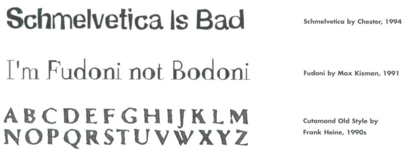
Postmodern Fonts
Warde claimed that “type well used is invisible as type, just the perfect talking
voice is the unnoticed vehicle for the transmission of words, ideas,” and, “Printing
demands humanity of mind…There is nothing simple or dull in achieving the
transparent page. Vulgar ostentation is twice as easy a discipline.”26 She probably would have hated the desecrated typefaces, that they’re visible and communicating in their own right, instead of being purely a transparent vessel.
One of the main motivators for postmodern designers was to be originators, playfully communicating meaning through forms. Wolfgang Weingart used conventional modernist typefaces and graphic forms to develop an alternative consisting of the same basic elements. “New Wave” designers ignored the modernist formula, experimenting freely with composition and typography. Neville Brody and David Carson pushed the boundaries of legibility; April Greiman worked with early digital technologies in conjunction with analog, creating collages that suggest “threedimensional space in a two-dimensional surface.”27 Greiman’s spread in a 1986 issue of Design Quarterly is a great example of how she opposed modernism’s masculine dominance and “denial of the person”28 through her complex designs.
Digital technological developments were a big contributor to the postmodern aesthetic and thinking. Technologies were suddenly much more accessible than before, exposing more people to design; and more people made fonts, used them, and became aware of them. Greiman’s work in Design Quarterly was reflective of cassette and video tape technology, inviting the reader to “concentrate on multiple message in any sequence, repeating or looping back between images.”29
Where is it going?
I don’t think Warde’s idea of a crystal goblet is completely useless today, but it could be adapted. Since I became interested in design a few years ago, I started to notice typefaces unlike before. So the condition that “good” typography should be “invisible” is somewhat unrealistic. And the more exposure I have to design courses, both studios and lectures, the less I can ignore what font the designer chose to set the text in. Yes, the forms of characters are a vehicle for transmitting information, but we still have to see that vehicle, and it should look good.
For the relationship between design and architecture, I’d say it’s grown to be even more different than when Smith wrote about it over ten years ago. Inscriptions on buildings are extremely rare, most places opt for signs that can be put up and taken down, businesses open and subsequently close so quickly in a way that can only be attributed to capitalism’s relentless push for profits. Additionally, buildings become just a shell, not unlike the “temples of commerce”30 of Behrens’ time, but with significantly less reverence for the structure itself. “Globalization leaves the neat concept of unity of style in shambles. Or perhaps it has been transformed into something more complex, more profound than we now can see. We can't identify it because it is too close. Can someone see the common spark?”31


Further developments in technology have brought design and architecture
together in a different way: designers are now working side by side with architects to
design digital interfaces through which users experience physical spaces of
architecture. Michael Rock discussed this shift in relationship in an issue of Perspecta,
and how branding and technology is largely responsible: “The graphic became a way to
signify newness because it was something that would be constantly shifted and
changed.”32 A lot of that work incorporates digital screens, so designers are designing environments, thinking about how people get information and navigate spaces that architects design. As with digital media in general, designers are loosing control over the final product or composition: “‘the object’ is the byproduct of the algorithm, but the algorithm is the thing that we designed.”33
1 Virginia Smith, “Preface: Typography’s Role in Modernism,” in Forms in Modernism: A Visual Set: The Unity of Typography, Architecture & The Design Arts (New York: Watson Gill Publications, 2005): 8.
2 Gerard Hadders, “Letter = Image,” in The Triumph of Typography: Culture. Communication. New Media, ed. by Henk Hoeks and Ewan Lentjes (Arnhem Houten: ArtEZ Press, Uitgeverij Terra, 2015), 325.
3 Hans Rudolf Bosshard, “The lettering of city buildings,” in The Triumph of Typography: Culture. Communication. New Media, ed. by Henk Hoeks and Ewan Lentjes (Arnhem Houten: ArtEZ Press, Uitgeverij Terra, 2015), 263.
4 Chris Burke, “Peter Behrens and the German Letter: Type Design and Architectural Lettering,” Journal of Design History, 5, no. 1 (1992): 19.
5 Ibid., 20.
6 Ibid., 27.
7 Ibid., 28.
8 Ibid.
9 Ibid., 29.
10 Virginia Smith, “Architecture and Type: A Modern Marriage,” AIGA, March 21, 2006, http://www.aiga.org/architecture-and-type-a-modern-marriage.
11 Bosshard, “lettering of city buildings,” 268.
12 Ibid., 263.
13 Ibid., 263-4.
14 Ibid., 264.
15 Virginia Smith, “The End of the Modern Movement,” in Forms in Modernism: A Visual Set: The Unity of Typography, Architecture & The Design Arts (New York: Watson Gill Publications, 2005): 142.
16 Bosshard, “lettering of city buildings,” 265.
17 Beatrice Warde, The Crystal Goblet, or Printing Should Be Invisible, London, 1955: 1.
18 Smith, “The End of the Modern Movement,” 125.
19 Virginia Smith, “Preface: Typography’s Role in Modernism,” 7.
20 Ibid., 9.
21 Ibid.
22 Smith, “The End of the Modern Movement,” 130.
23 Smith, “Architecture and Type.”
24 Smith, “The End of the Modern Movement,” 132.
25 Smith, “Prefaces: Typography’s Role in Modernism,” 9.
26 Warde, The Crystal Goblet, 4.
27 Smith, “The End of the Modern Movement,” 127.
28 Ibid.
29 Ibid.
30 Burke, “Peter Behrens,” 27.
31 Smith, “Architecture and Type.”
32 Michael Rock, “Graphic Design in the Expanded Field,” Perspecta 44, Domain (2011): 169.
33 Ibid., 170.