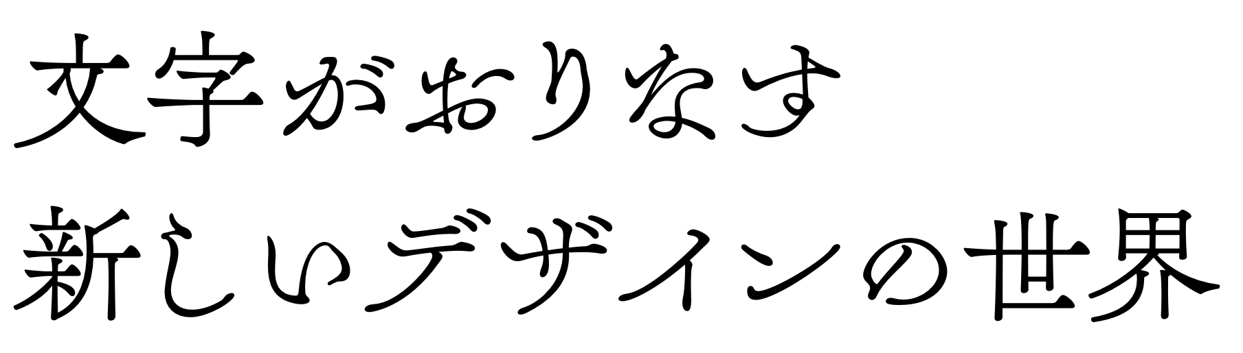
Contemporary East Asian Typefaces — Authenticity, Heritage, and Globalization
Written in November 2018 for a course on East Asian Design History
Typeface design is a highly specialized field within the larger sphere of graphic design.
Both globalization and the preservation of cultural identity have increased demand for
quality digital fonts in non-Latin scripts, which is now possible: digital technology
improved the tools for designing fonts, and the Internet further democratized that
process. The chosen artifacts are examples of contemporary fonts in East Asian scripts,
designed by East Asian designers, largely for an East Asian audience.
Japanese Type designers Mariko Takagi and Akira Kobayashi have written some
introductory texts for westerners and in western terminology to help aid in cross-
cultural communication about East Asian type design. Information ranges from ways to
classify them along the lines of familiar latin type, how the languages/scripts are read,
the anatomy of the characters, how they’re crafted, and so on. Writing such as this is
especially important for westerners who design non-latin scripts.
Kreuzbauer and Keller (2017) articulated authenticity judgement as a truth- seeking process, where the judge interprets if a sign-vehicle represents a sign-object, braking down the process into three interwoven elements: goal and rule determination, inferred producer’s agency control, and inferred producer’s intention. Wong (2013) helps illustrate how that semiotic thinking can be applied to cultural interaction in a globalized world, specifically three ways that culture is approached through design: vernacular, cross-cultural, and transitional. To determine authenticity, my analysis focused on the following factors: letterform characteristics, interpretation of heritage or history, and positioning within a globalized world.
Kreuzbauer and Keller (2017) articulated authenticity judgement as a truth- seeking process, where the judge interprets if a sign-vehicle represents a sign-object, braking down the process into three interwoven elements: goal and rule determination, inferred producer’s agency control, and inferred producer’s intention. Wong (2013) helps illustrate how that semiotic thinking can be applied to cultural interaction in a globalized world, specifically three ways that culture is approached through design: vernacular, cross-cultural, and transitional. To determine authenticity, my analysis focused on the following factors: letterform characteristics, interpretation of heritage or history, and positioning within a globalized world.
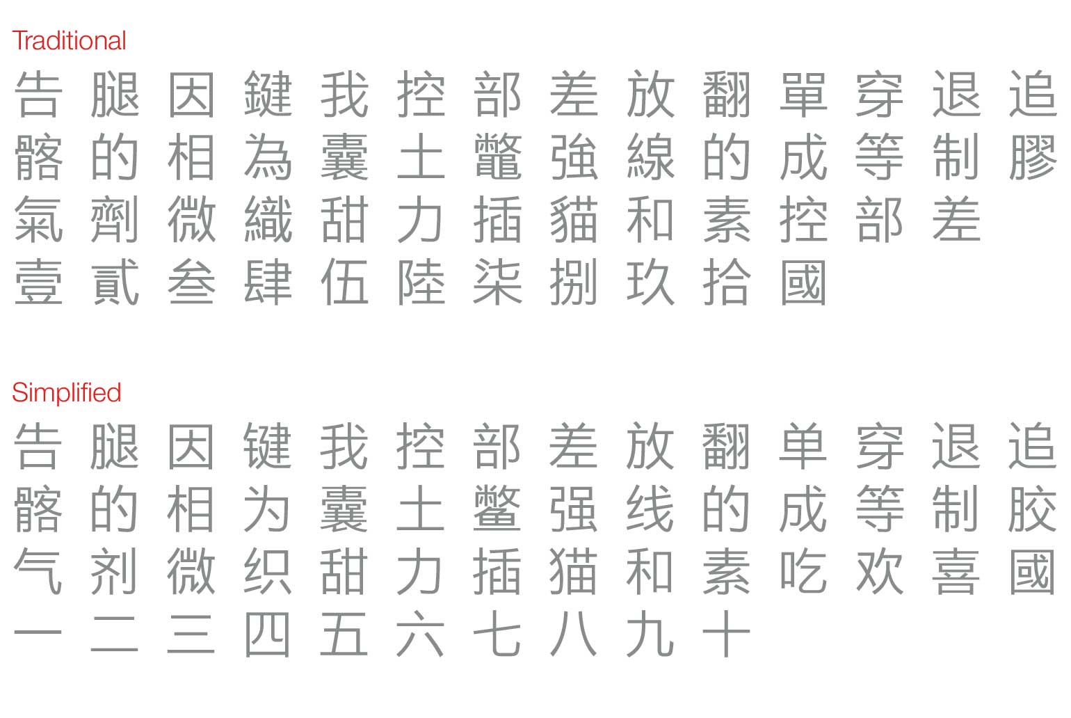
M Ying Hei (China)
M Ying Hei is family of fonts in the hanzi script, in a variety of weights two variations:
HK for traditional and PRC for simplified Chinese. The characters themselves are in the
monolinear Heiti style, the hanzi equivalent to a latin sans-serif. Strokes are minimal
but sharp, described as “unfussy, stripped-down version of the more elaborate Kaishu
typefaces that have defined the look of Chinese characters for 1,500 years” (Monotype,
n.d.). A key design element of this font is its wider zhonggong, the centre part of the
characters, equivalent to a large x-height in latin letterforms, making it more legible on
screen and in print. Monotype argues
that the wider zhonggong will make M
Ying Hei work on digital devices better
than its predecessors: since it allows for
more whitespace inside the characters,
it performs well in backlit situations.
M Ying Hei was designed by Kenneth Kwok and Robin Hui for Monotype HK, the
Hong Kong branch of global typography company Monotype. A large company like
Monotype would have the financial and quality design resources to dedicate to a project
of this scale, as the Chinese character set is complex and intimidating in size, with
around 60,000-80,000 named characters (Takagi, 2013). The typeface was designed for
performance and legibility on screen and in print, and intended to be paired with
corporate typefaces Univers, Frutiger, Neue Hevletica, Avenir Next.
When placing M Ying Hei in the context of a globalized world, Monotype
emphasized the importance of Heiti style as the voice of contemporary life, appearing
“calm and neutral, impressing on the reader an air of modernity without extraneous
fuss,” in addition to their ability to work across language boundaries (Monotype, n.d.).
M Ying Hei can be considered a transnational approach to type design, and is an
authentic Chinese typeface: the characters are contemporary and thoughtful in their
design, the corporate typefaces it is designed to work with were intended to be universal
—the “international style”, which shares visual expressions with transnational design
(Wong 2013)—and this is a contemporary Chinese extension of that attitude.
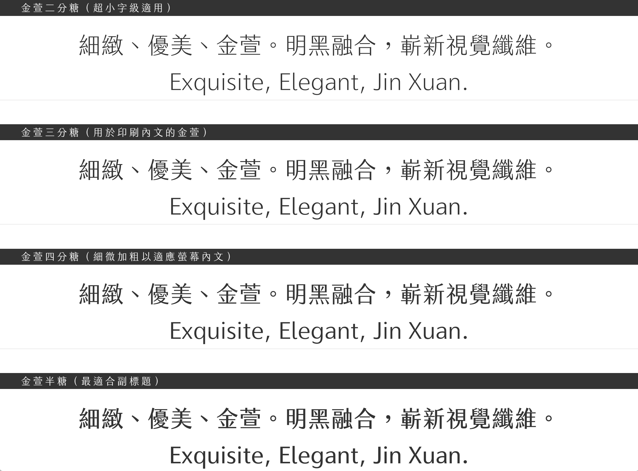
Jin Xuan (Taiwan)
Jin Xuan is a traditional Chinese font in the Min-Hei style, a sort of hybrid approach
combining features from Mingti and Heiti
character forms, not entirely unlike a slab serif
in theory, but more like Takagi’s (2015) dual script classification of “semi serif”. The font itself has a light color and low contrast
without being monolinear, giving it a youthful, friendly, sophisticated tone of voice.
Jin Xuan was designed by Justfont—stylized “justfont”—one of the largest
Chinese webfont producers in Taipei, Taiwan. This typographic project was one of many
that the Hanzi (2017) filmmakers focussed on in their documentary, largely because
it was the first crowdfunded font in Taiwan. justfont is mostly comprised of young,
entrepreneurial designers and the fact that they were able to develop Jin Xuan shows
that there is a wider knowledge of typography and fonts in general. This could be due to
the prevalence of mobile phones, computers, and navigation systems that use of fonts
and when they’re bad or insufficient, it’s extremely noticeable even to untrained eyes.

When looking at Jin Xuan through a wider lens, it reflects the accessibility and
democratization of design process and tools that has been able to happen because of
advancements in technology. Technology held back development of digital hanzi fonts,
previously, the Chinese language files were too large to download directly and then
upload online. Cloud-based webfont hosting services have made quality fonts accessible,
and justfont is an example, having established their cloud service in 2012 (“justfont”,
n.d.). As mentioned in Hanzi (2017), Taiwan doesn’t have an established typographic
legacy like Hong Kong or Japan does. justfont wants to change that, offering online
courses in typography, contributing to the dissemination of design education and
inspiring a new generation. Jin Xuan is an authentic typeface and I would argue that
it was designed through a vernacular approach; instead of taking inspiration from
the past, justfont represented a hybrid contemporary spirit for Taiwan, by Taiwan.
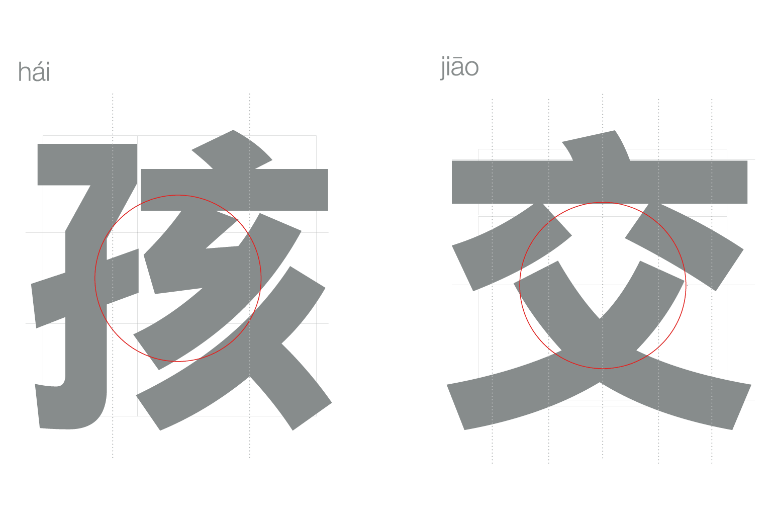
A1 Gothic (Japan)
A1 Gothic is a font in Japanese scripts Kanji and Kana, comprised of Hiragana and
Katakana, and Latin, which is called Romaji in Japanese and can be considered an
additional fourth script (Takagi, 2015). As the name points out, it’s in the gothic style,
the Japanese equivalent to a sans serif, and the core skeleton is based on old-style
gothic A1 Morning (Morisawa, 2017). A warm tone is conveyed through rounded ends
of strokes and ink spot expressions at intersections of strokes, a reference to retro
technologies as such expression “are technically inevitable by phototypesetting
machines” (Slanted #31, 2018). Furthermore, A1 Gothic is highly readable when
set vertically—historically, Japanese was set vertically and read top to bottom, then right to left; more recently, they have adopted a western horizontal setting, where it is read
from left to right (Kobayashi, 2002).
A1 Gothic was designed by Morisawa, one of the first type foundries in Japan,
with a “commitment to undertaking leading-edge research and development on the field
of typography” (Slanted #31, 2018). Morisawa has released a video (Morisawa, 2015) on
their typographic process: the team determines its core characteristics, the chief
designer designs the “fixed characters”—the 500 most frequently used characters—by
hand, characters are scanned and digitized, and then they are reviewed and production
continues. Kanji is developed first, then the Kana. Various alignment, density, and
contextual tests are conducted, and adjustments are made.
In a global context, A1 Gothic’s production is indicative of a collectivism in Japanese culture, as individual designers are not named, but rather the team is considered as a whole, as “Morisawa.” Western culture is highly individualistic, and contributors to typeface designs are always mentioned on either the font’s websites or places where they can be purchased. While A1 Gothic has a Latin variant, it seems as if it is not marketed towards or intended for Western use, and more likely would be used in Japan as the Romaji component: “Like the kanji characters, which be borrowed from China a couple of thousand years ago, Latin letters are now a crucial part of our writing system. We use them in our text in Japanese, often to design a name of an organization,” (Kobayashi 2002). All of this considered, A1 Gothic is an authentic Japanese typeface, and likely a vernacular one, as Western cultural elements are not considered anywhere in the process.
In a global context, A1 Gothic’s production is indicative of a collectivism in Japanese culture, as individual designers are not named, but rather the team is considered as a whole, as “Morisawa.” Western culture is highly individualistic, and contributors to typeface designs are always mentioned on either the font’s websites or places where they can be purchased. While A1 Gothic has a Latin variant, it seems as if it is not marketed towards or intended for Western use, and more likely would be used in Japan as the Romaji component: “Like the kanji characters, which be borrowed from China a couple of thousand years ago, Latin letters are now a crucial part of our writing system. We use them in our text in Japanese, often to design a name of an organization,” (Kobayashi 2002). All of this considered, A1 Gothic is an authentic Japanese typeface, and likely a vernacular one, as Western cultural elements are not considered anywhere in the process.

Tazugane Gothic (Japan)
Tazugane Gothic is a ten-weight font family in the Japanese scripts and Latin. The
typeface design is a take on the western Humanist sans serif style, where the “human”
element is grounded in handwriting. Tazugane Gothic aims to balance “the look of
traditional Japanese handwriting with a distinctly human flavor that supports stability
and readability,” (Monotype, 2018).
Tazugane Gothic is the first original Japanese typeface produced by Monotype.
Akira Kobayashi, who was shown giving lettering workshops in Hanzi (2017) and is the
director of Monotype in Germany, oversaw the development of this typeface. Kazuhiro
Yamada is the main person responsible for designing Japanese typefaces at Monotype,
and Ryota Doi, who received his Masters in Typeface Design from Reading, also worked
on this project.

When placed in a wider context, it seems unbelievable that it took this long for
Monotype, one of the largest and most influential developers of typography, to design a
unique Japanese typeface. However, since it was designed to compliment Frutiger, one
can figure that the designers had those letterforms in mind when working on Tazugane
Gothic, even though it has its own latin variant. However, it can still be perceived as an
authentic cross-cultural or even transnational approach to Japanese type design, as it
is an interpretation of Japanese handwriting, based on a western model of adapting
handwriting to type. The construction of the typeface has a wide range of applications
and incredible potential.
Tsukushi Q Mincho (Japan)
Tsukushi Q Mincho is a Kanji and Kana typeface that comes in two variations. As the
name says it’s categorized in the mincho style, equivalent to a Latin serif, and to my
American eyes looks incredibly interesting. However, when referencing Takagi’s (2013)
multi-script classification matrix, it falls under the “dynamic analogue” category, where
a western script-handwriting style would be. Slanted Magazine’s Japan issue described
it as having a “dynamic and stretchy expression beyond the frame of the mincho style,” and can be cursive when set horizontally (Slanted #31, 2018), and is said to be the most
innovative Mincho type. Tsukushi Q Mincho showcases the heritage of Japanese
characters, in addition to their unity and rhythm (Fontworks, 2017).
Shigenobu Fujita is the lead designer for Fontworks Japan, the Japanese branch
of an international type foundry, and designed this typeface and many of their other
offerings. Like the artifacts mentioned previously, Tsukushi Q Mincho is available as
a webfont through Fontworks’ cloud service. As a westerner who does not read or
understand the Japanese, their website was difficult to navigate as the English site
only has information about the company and designers, not the fonts themselves.

When determining authenticity, one can consider Tsukushi Q Mincho in a global
context: it refers specifically to Japanese calligraphic history, without any influence
from or marketing towards the west or other cultures, and is a vernacular design.
Sandoll Gothic Neo1 (Korea)
Sandoll Gothic Neo1 is a multilingual font
family, comprised of characters in Hangul,
Latin, Greek, and Cyrillic scripts, ranging in
weight from light to bold. Since the Hangul
script is the basis of the typeface, it can be
considered gothic in style. It was designed for
editorial use, with thinner-width characters and an emphasis on optical balance between
Hangul and other scripts. Additionally,
Sandoll Gothic Neo1 is licensed to match
Guardian Sans from Commercial Type, the
distinctive typeface used in British newspaper
The Guardian (Slanted, 2018).
As the name indicates, Sandoll is the type foundry who designed this particular
family of fonts. Sandoll was the first Korean type foundry and works with international
type foundries and technology brands like Google, Apple, Adobe, and Microsoft on
typographic products (Sandoll, n.d.). The font was designed by Kwon Kyungseok,
senior type designer, and Do-kyung Lee, director of the custom fonts team and leader
in executing large-scale global projects with multinational corporations.
When analyzed as a typeface in a globalized landscape, Sandoll Gothic Neo1 is an example of an authentic transnational approach to Korean type design. Wong defines transnational design as follows: “design embedded with non-coded iconic messages thatcan be communicated beyond national boundaries. The appearance of transnational design could be represented in abstract forms, and shapes.” (Wong, 2013). The abstract formal quality is represented here in the extreme geometric quality of the typeface. On a literal level, Sandoll Gothic Neo1 is transnational because of how Sandoll uses the Korean hangul script as a basis for the other scripts’ designs, the range of languages and cultures the four scripts cover, and its place in international news media.
When analyzed as a typeface in a globalized landscape, Sandoll Gothic Neo1 is an example of an authentic transnational approach to Korean type design. Wong defines transnational design as follows: “design embedded with non-coded iconic messages thatcan be communicated beyond national boundaries. The appearance of transnational design could be represented in abstract forms, and shapes.” (Wong, 2013). The abstract formal quality is represented here in the extreme geometric quality of the typeface. On a literal level, Sandoll Gothic Neo1 is transnational because of how Sandoll uses the Korean hangul script as a basis for the other scripts’ designs, the range of languages and cultures the four scripts cover, and its place in international news media.
Technological improvements in production tools and democratization of design has greatly impacted the quality and accessibly of fonts in non-Latin scripts. Languages with large character sets are finally able to be represented well in digital typefaces as webfonts hosted online. All six artifacts discussed in this essay are authentic, but vary in their approach to cultural interaction. Communication is the core of all typographic design, and more voices are being heard than ever before.
Fontworks. (2017). Tsukushi Q Mincho. Retrieved from https://fontworks.co.jp/ fontsearch/item?TsukuQMinLStd-L&word=A%20%0Anew%20design% 20world%20where%20letters%20are%20arranged
Hanzi. (2017). Retrieved from https://yorku.kanopy.com/video/hanzi
Justfont. (n.d.). Jin Xuan. Retrieved from https://jinxuan.justfont.com/
Kobayashi, Akira. (2002). How do the Japanese read?. In Berry, J.D., (Ed.), Language, culture, type: International type design in the age of Unicode (62-64). New York: ATypI.
Kreuzbauer, R., & Keller, J. (2017). The authenticity of cultural products: A psychological perspective. Current Directions in Psychological Science, 26(5), 417-421.
Monotype. (n.d.). A digital-ready Chinese sans-serif is born. Retrieved from https:// www.monotype.com/resources/font-stories/a-digital-ready-chinese-sans-serifis-born/
Monotype. (2018). Tazugane® Gothic Font Family. Retrieved from https:// www.fonts.com/font/monotype/tazugane-gothic
Morisawa, Inc. (2015, December 21). How Morisawa Font Products Are created. [Video file]. Retrieved from https://www.youtube.com/watch? v=Mo0TXNAQ290
Morisawa, Inc. (2017). A1 Gothic. Retrieved from https://www.morisawa.co.jp/about/ news/3603 Sandoll. (n.d.)
Sandoll Gothic Neo1. Retrieved from http://www.sandollcloud.com/ font/Sandoll/221.html
Slanted. (2018). Yearbook of Type III. Karlsruhe, Germany: Slanted Publishers
Slanted. (2018). Contemporary Typefaces. Slanted #31, insert booklet. Karlsruhe, Germany: Slanted Publishers
Takagi, Mariko. (2013). “Hanzi-Graphy: Typographic translation between Latin letters and Chinese characters.” Retrieved from https://www.academia.edu/12132299/ Hanzi-Graphy_Typographic_translation_between_Latin_letters_and_ Chinese_characters
Takagi, Mariko. (2015). “Kanji Graphy: Visual translation between Latin letters and Japanese characters.” Retrieved from https://www.academia.edu/14997299/ Kanji_Graphy_Visual_translation_between_Latin_letters_and_ Japanese_characters
Wong, Wendy Siuyi. (2000). Formulating the Creative Logic of Chinese Typography. Journal of Visual Literacy, Vol. 20(1): 79-88.
Wong, Wendy Siuyi. (2013). The Three Orders of Cultural Signification: A Proposed Design Thinking Theory Considering Cultures and Globalization. DesignEd Asia 2013 Conference Proceedings: Delimitation–Creating with Constraints. The Hong Kong Polytechnic University, Hong Kong.